Wednesday, November 7, 2012

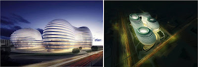
Galaxy Soho, Beijing

Architects: Zaha Hadid Architects
Location: Soho, Beijing, China

Area: 332857.0 sqm
Building Height: 67m
Shaping: Parametric Building
Feature: Slicers
Program: Mixed used of Commercial / Industrial Office
Construction Year: 2012 
This new release of the constructed Galaxy SOHO project in the central Benjing is a office, retail and entertainment complex. It become an integral part of the living city, inspired by then grand scale of Beijing.
Composition:
Five continuous flowing volumes that are set apart, fused and linked by stretched bridges.
These volumes adapt to each other in all directions, generating a panoramic architecture without corners or abrupt transitions that break the fluidity of its formal composition.
Full of imagination and surrealism, the unique design concept makes Galaxy SOHO a new architectural landmark in Beijing on par with the Bird's Nest National Stadium and the CCTV Tower.
Interpretation of Nature
the concept of the design is inspired by the ancient Chinese terraced rice field. Derived from nature., parametric design is the synthesis of contemporary digital technology and the natural landscape. The multiple flowing plateaus act as a rice field in the mountains, connecting various volumes and forming an urban landscape.


The great interior courts of the project are a reflection of traditional Chinese architecture where courtyards create an internal world of continuous open spaces. 
The architecture is no longer composed of rigid blocks, but instead comprised of volumes which incorporate to create a world of continuous mutual adaptation and fluid movement between each building.

360 degree view
The architectural approach for this project is to create an ensemble of individual volumes that blend together to create a more monumental whole. The separate volumes have their own atrium and cores, but merge together at various levels, providing shaded outdoor plateaus and internal spaces with dramatic views.

Shifting plateaus shift multiple levels into each other's view forming within the design impact upon each other, to generate a deep sense of immersion and envelopment within an environment of stimulation. The architecture unfolds below, above, and into layers in all directions with a logic of continuity and multilevel curve-linearity.  It is a 360-degree architectural world which has no corners, no disrupted transitions, but in which everything evolves — very much inspired by nature.
As users enter deeper into the building, they discover intimate spaces that follow the same coherent formal logic of continuous curve-linearity.
The project is comprised of deep vistas that are formulated by hundreds of meter of interests in all directions. The strategy here is to create a space of easy flow and easy orientation. One discovers an interplay of light and shadow and of closed and open space while moving within the volumes.
The lower three levels of Galaxy SOHO house public facilities for retail and entertainment. The levels immediately above provide work spaces for clusters of innovative businesses. The top of the building is dedicated to bars, restaurants and cafés that offer views along one of the greatest avenues of the city. These different functions are interconnected through intimate interiors that are always linked with the city, helping to establish Galaxy SOHO as a major urban landmark for Beijing.
references : ArchDaily
1.http://www.archdaily.com/287571/galaxy-soho-zaha-hadid-architects/
2. http://www.archdaily.com/290599/video-zaha-hadid-galaxy-soho-beijing/?utm_source=dlvr.it&utm_medium=twitter

Thursday, November 10, 2011

Sennett house


by SCDA- Sennett Estate, Singapore-2000

Client:
Sennett house is designed for a three-generation family
a married sister & brother together with their families share a compound with their mother

Ground Floor Plan
First Floor Plan
1.  carport
2.  forecourt
3.  reflecting pool
4.  service court
5.  entrance
6.  living
7.  dining
8.  dry kitchen
9.  guest room
10.patio
11.pool
12.court
13.powder room
14.wet kitchen
15.utility
16.maid's room
17.bathroom/toilet


Second Floor Plan
18.master room
19.bedroom
20.family room
21.dressing room
22.master room
23.bridge
Section


site area analysis:
-suburban area of predominantly low-rise, semi-detached houses, fronted by neat lawn
-British brought this low density housing model to S'pore & it served well in past, but the increasingly anachronistic in the current situation where it has become essential to use land efficiency at higher densities
- forced resulting the 'Urbanization of Suburbia'

Concepts: globalization

inexorable of western media, the extended family + the 'filial piety' are enduring Asian value

design analysis:
-2 linear units, mirror images of each other
-principal organizing element: linear central courtyard, extends from very front of the site to the rear boundary, relates to different activities within the adjoining houses:
#front = semi-public space
#center = private space, shared recreation area related to the entrance of houses.
#rear = become a service yard, shielded from the gaze of visitors by a head height wall
there are thresholds along the way which signal the transition from public to private area. At the center of the private domain is a dark blue reflecting pool
-entering through either of 2 entrance gates 1 encounter, a screen wall comprising horizontal slabs of grey granite which restrict view of the private activities of families
-moving either to left or right of the screen wall(a landscaped forecourt),precedes a short flight steps which marks the arrival in the raised center courtyard

Thursday, November 3, 2011

SCDA Architects

SCDA Architects (Soon Chan Design Architects)
-the Architecture of Soo Chan
-

Design philosophy
-tranquility
-calmness
-qualified by light, space & structure orders

intersects Eastern and Western influences
-born in Penang, M'sia
-studied & trained: USA
-work: S'pore
draw on Eastern & Western traditions

concept of Globalization
-a natural part of social & cultural landscape
-using globally perfected building technologies & aesthetics
-composition array & material realisation that derives from the local geographic, geological and climatological realities.

a modern tropical Architecture 
1. he cut corners - he refuses to let the rooms remain stable spaces

2.he creates mirrored versions of the same house next to each other & builds whole neighbourhoods by fitting courtyard compounds, open spaces and roads ard each other in meandering pattern

3.buildings look like Modernist structure tat tend to dissolution into while panels, glass & exposed concrete

4.details pull to the context of South-East Asian region: slopping roofs appear,wood shutters, the rooms are open to each other to encourage the breezes to cut through the humid warmth


5.the free plan in design are grounded in classical ideals of scale and proportions

6.the spaces within the free plans overlap and are further defined through the careful placement and clear expression of walls and ceiling planes that intersect with or 'slide by' each other

7.compositionally these walls propagate from multiple 'centres' withing the flowing spaces

8.these 'centres' implied withing the open concept planning are reinforced when the spaces are experienced sequentially and hierarchically through choreography processions that recentre and realign the perceptual 'axis' that terminates in objects,landscaped vistas or open spaces.

Sunday, November 15, 2009

Organic Architecture

-a philosophy of Architecture which promotes harmony between human habitation and the natural world through design approaches so sympathetic and well integrated with its site that buildings, furnishings, and surroundings become part of a unified, interrelated composition.


Fallingwater by Frank Lloyd Wright

Organic Architecture is also translated into the all inclusive nature of Frank Lloyd Wright’s design process. Materials, motifs, and basic ordering principles continue to repeat themselves throughout the building as a whole. The idea of organic architecture refers not only to the buildings' literal relationship to the natural surroundings, but how the buildings' design is carefully thought about as if it were a unified organism. 


a list of rules towards the design of organic architecture
"Let the design:
  • be inspired by nature and be sustainable, healthy, conserving, and diverse.
  • unfold, like an organism, from the seed within.
  • exist in the "continuous present" and "begin again and again".
  • follow the flows and be flexible and adaptable.
  • satisfy social, physical, and spiritual needs.
  • "grow out of the site" and be unique.
  • celebrate the spirit of youth, play and surprise.
  • express the rhythm of music and the power of dance."
 
"Using Nature as our basis for design, a building or design must grow, as Nature grows, from the inside out. Most architects design their buildings as a shell and force their way inside. Nature grows from the idea of a seed and reaches out to its surroundings. A building thus, is akin to an organism and mirrors the beauty and complexity of Nature." 

link refer: http://en.wikipedia.org/wiki/Organic_architecture